Understanding Color Psychology in Exhibition Environments
Color psychology in exhibition environments is a powerful tool for creating impactful show booth designs. The strategic use of colors can significantly influence attendees' perceptions, emotions, and behaviors. By understanding the psychological effects of different hues, exhibitors can create visually appealing spaces that align with their brand identity and marketing goals.
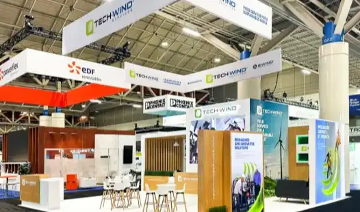
In the context of trade shows, certain colors tend to evoke specific responses. For example, red is often associated with energy, passion, and urgency. It can create a sense of excitement and draw attention to key areas of the booth. Blue, on the other hand, is linked to trust, stability, and professionalism. It's commonly used in corporate settings to convey reliability and expertise.
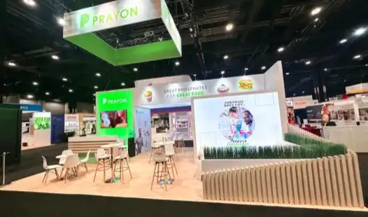
Yellow is a cheerful color that can promote optimism and creativity. It's effective for attracting attention and creating a welcoming atmosphere. Green is associated with growth, health, and environmental consciousness. It's particularly useful for brands promoting eco-friendly products or services.
Cultural Considerations in Color Selection
When designing Show Booth Design for international exhibitions, it is essential to carefully consider the cultural associations of colors, as these can significantly influence how your booth is perceived by a global audience. Colors are powerful visual cues that convey emotions, values, and messages, but their meanings can vary greatly across different cultural contexts. For example, in many Western cultures, white is often associated with purity, cleanliness, and simplicity, making it a popular choice for modern and minimalist booth designs. However, in certain Eastern cultures, white is linked to mourning and funerals, which could unintentionally create a negative impression if used without consideration.
Similarly, the color red carries diverse interpretations around the world. In Chinese culture, red is considered auspicious and symbolizes luck, prosperity, and celebration, making it a favored choice for attracting positive attention. Conversely, in some Western contexts, red can signal danger, warnings, or urgency, which could potentially create confusion or unintended messaging. Even colors like blue, green, or yellow can evoke different emotions depending on cultural background, ranging from tranquility and harmony to jealousy or caution.
Therefore, understanding these cultural nuances is crucial when selecting a color palette for your booth. Conducting research on your target audience, testing color schemes in different cultural contexts, and consulting with local experts can help ensure that your booth design communicates the intended message. By thoughtfully considering cultural color associations, exhibitors can create visually appealing and culturally sensitive booths that resonate positively with international visitors, enhance brand perception, and foster meaningful engagement across diverse markets.

Implementing Color Strategies in Booth Design
Implementing effective color strategies in show booth design requires a thoughtful approach that balances aesthetics, brand identity, and psychological impact. The goal is to create a visually cohesive space that attracts attention, communicates key messages, and leaves a lasting impression on attendees.
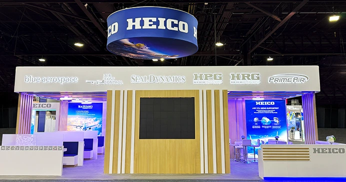
One effective strategy is to use a dominant color that aligns with your brand identity as the primary hue in your booth design. This color should be prominent in your graphics, signage, and structural elements. Complementary colors can be used as accents to create visual interest and highlight specific areas or products within the booth.
Consider using color to guide visitor flow through your booth. Brighter, more vibrant colors can be used to draw attention to entry points or key display areas, while softer, more subdued hues can create comfortable spaces for conversations or product demonstrations.
Balancing Color with Lighting and Materials
The interaction between color, lighting, and materials is a crucial aspect of effective show booth design, as it directly influences how visitors perceive and engage with the space. Colors can appear dramatically different depending on the type and intensity of lighting used within the booth. For instance, natural daylight tends to render colors more accurately and vividly, creating a sense of openness and authenticity. Fluorescent lighting can sometimes produce cooler tones, potentially altering the warmth or mood intended by the color palette. LED illumination, on the other hand, offers flexibility in both brightness and color temperature, allowing exhibitors to create specific atmospheres and highlight key elements of the booth.
Equally important is the selection of materials, which can enhance or diminish the impact of your chosen colors. Glossy surfaces, such as polished metals or acrylic panels, can intensify hues, create reflections, and produce a vibrant, dynamic visual effect that draws attention. Matte finishes, by contrast, diffuse light and soften the appearance of colors, lending a more subtle and sophisticated feel. Incorporating textured materials, such as fabric, wood, or patterned panels, adds depth and tactile interest, making the booth environment more immersive and engaging for visitors.
By carefully considering the interplay of color, lighting, and materials, exhibitors can create a cohesive and visually compelling booth that not only communicates brand identity effectively but also enhances the overall visitor experience. Thoughtful design choices in these areas ensure that the booth is both aesthetically appealing and strategically functional, leaving a lasting impression on attendees.
Measuring the Impact of Color in Trade Show Success
Measuring the impact of color choices on trade show success involves both quantitative and qualitative assessments. While it's challenging to isolate color as a single factor in booth performance, several indicators can provide insights into its effectiveness.
Foot traffic is a key metric that can be influenced by color choices. By tracking the number of visitors to your booth and comparing it to previous events or competitor booths, you can gauge the attractiveness of your color scheme. Additionally, heat mapping technologies can reveal which areas of your booth attract the most attention, potentially correlating with color placement.
Engagement time is another important measure. If visitors are spending more time in your booth, it may indicate that your color choices are creating a comfortable and inviting atmosphere. This can be particularly relevant for areas designed for product demonstrations or one-on-one conversations.
Gathering Feedback and Iterating Design
Post-event surveys and interviews with booth visitors are invaluable tools for gathering detailed feedback on the effectiveness of your color choices and the overall visual impact of your Show Booth Design. By asking targeted questions, you can gain insights into how attendees perceived the aesthetics, atmosphere, and emotional resonance of your design. Questions might explore whether the color palette attracted attention, felt welcoming or professional, and effectively represented your brand identity.
Visitors can also provide feedback on the memorability of the booth, which is critical for long-term brand recall and engagement. Collecting qualitative feedback in this manner complements quantitative metrics, such as foot traffic, dwell time, and engagement with interactive elements, giving a holistic view of booth performance.
Using this feedback strategically allows exhibitors to refine and improve future booth designs. Insights from surveys and interviews can guide adjustments in color schemes, lighting, materials, and overall layout to better align with audience preferences and industry standards.
Additionally, A/B testing different color combinations across multiple trade shows can help determine which palettes resonate most strongly with your target market. Over time, this iterative process enables exhibitors to create more visually compelling, emotionally engaging, and effective booths that enhance brand perception, foster meaningful connections, and maximize return on investment at every event.
Conclusion
The psychology of color in trade show booth design is a powerful tool for creating impactful and memorable exhibition experiences. By understanding the emotional and psychological effects of different hues, considering cultural contexts, and implementing strategic color schemes, exhibitors can significantly enhance their booth's attractiveness and effectiveness. Balancing color choices with lighting, materials, and brand identity is crucial for creating a cohesive and engaging space.
Measuring the impact of color through various metrics and gathering feedback allows for continuous improvement in booth design strategies. Ultimately, thoughtful color implementation can contribute significantly to a successful trade show presence, helping brands stand out in crowded exhibition halls and leave lasting impressions on attendees.
At HR Exhibits, we understand the intricate relationship between color psychology and successful show booth design. Our team of experts combines creativity with deep industry knowledge to create visually stunning and psychologically impactful exhibition spaces. Whether you're participating in international trade shows, industry exhibitions, or planning new product launches, we're here to bring your vision to life.
With our comprehensive service package and local support in Las Vegas, we ensure that your trade show presence is both memorable and effective. Ready to make a colorful impact at your next event? Contact us at info@hrexhibits.com to start designing your perfect booth today!
FAQ
How far in advance should I start planning my trade show booth design?
Ideally, you should begin planning 3-5 months before the event. This allows ample time for design, fabrication, and logistics. However, our team at HR Exhibits is flexible and can handle urgent projects if needed.
What information do you need to start designing my booth?
We typically require your booth size, show name, design ideas, and budget to create a tailored proposal. This helps us understand your needs and develop a concept that aligns with your goals.
Do you offer storage solutions for booth materials after the show?
Yes, we provide convenient local storage for your booth materials in Las Vegas. This ensures long-term support for future events and simplifies logistics for recurring shows.
References
1. Smith, J. (2022). "Color Theory in Exhibition Design: Psychological Impact and Brand Alignment". Journal of Trade Show Marketing, 15(3), 78-92.
2. Johnson, A. & Lee, S. (2021). "Cultural Variations in Color Perception: Implications for International Trade Show Design". Global Exhibition Quarterly, 8(2), 112-128.
3. Brown, T. (2023). "Measuring ROI: The Role of Color in Trade Show Booth Performance". Exhibition World, 29(4), 45-59.
4. Garcia, M. et al. (2022). "The Interplay of Lighting and Color in Creating Memorable Trade Show Experiences". Lighting Design & Application, 17(1), 33-47.
5. Wilson, K. (2023). "Evolving Trends in Trade Show Booth Design: From Color Psychology to Interactive Technologies". International Journal of Event Management, 12(3), 201-215.