The Role of Typography in Brand Communication at Trade Shows
In the bustling environment of a trade show, effective communication is paramount. Typography serves as a silent ambassador for your brand, conveying your message even before visitors engage with your staff. The fonts you choose and how you display text can significantly impact how attendees perceive your company and products.
Creating Visual Hierarchy
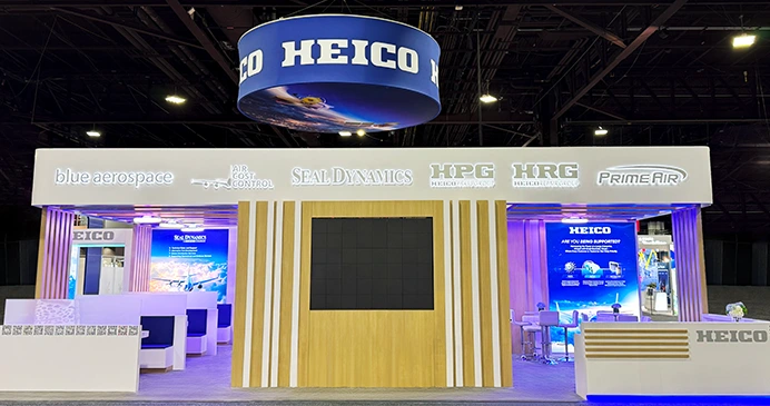
One of the primary functions of typography in exhibit design is to create a visual hierarchy. This hierarchy guides visitors' eyes through your trade show exhibit, highlighting key information and creating a logical flow of content. By varying font sizes, weights, and styles, you can direct attention to your most important messages, product names, or calls to action.
For example, you might choose to use a large, bold font for your company name or tagline prominently displayed at the top of your booth, ensuring it captures attention from a distance. Medium-sized headers can then organize product categories, while smaller text provides detailed descriptions. This layered and hierarchical approach allows attendees to quickly understand the key messages of your exhibit, while also giving them the opportunity to explore specific areas of interest in greater depth, creating a more intuitive and engaging visitor experience.
Enhancing Brand Identity
Typography is an integral part of your brand identity, and your trade show exhibit is an opportunity to reinforce this identity in a physical space. Consistent use of your brand's fonts across all elements of your exhibit - from large banners to small product labels - creates a cohesive look that strengthens brand recognition.
Moreover, the style of typography you choose can communicate subtle messages about your brand's personality. A sleek, modern sans-serif font might convey innovation and cutting-edge technology, while a classic serif font could suggest tradition and reliability. Careful selection of typography can help align your exhibit with your overall brand image and the specific message you want to convey at the trade show.

Practical Considerations for Typography in Trade Show Exhibits
While the aesthetic aspects of typography are important, there are also practical considerations to keep in mind when designing for trade show exhibits. These factors can significantly impact the effectiveness of your typography in the unique environment of a trade show floor.
Readability at a Distance
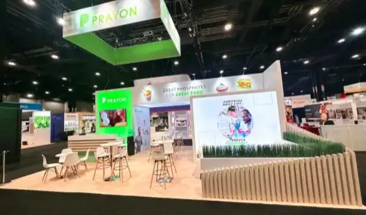
Trade show attendees often view exhibits from a distance before deciding to approach. This means your typography needs to be legible not just up close, but from several feet or even yards away. Consider using sans-serif fonts for large text elements, as they tend to be more readable at a distance. Additionally, ensure there's sufficient contrast between your text and background colors to maximize visibility.
When designing your trade show exhibit, it is helpful to create detailed mock-ups and examine them from a variety of distances to ensure that all key messages remain clear, legible, and impactful. Remember, the primary goal is to attract attendees to your booth, so your main headlines and branding elements should be prominently visible and visually enticing even from afar, capturing attention and encouraging visitors to engage with your display.
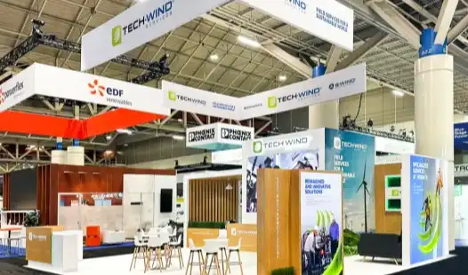
Balancing Information Density
While it's tempting to include as much information as possible in your exhibit, overcrowding your space with text can be counterproductive. Too much text can overwhelm visitors and deter them from engaging with your booth. Instead, use typography to create a balance between providing necessary information and maintaining visual appeal.
Consider using a mix of short, impactful headlines and more detailed body text. The headlines can grab attention and convey key points quickly, while the body text can provide additional information for those who want to learn more. This approach allows you to cater to both casual passersby and interested prospects who want to dive deeper into your offerings.
Innovative Typography Techniques for Modern Trade Show Exhibits
As technology advances and design trends evolve, new opportunities arise for innovative use of typography in trade show exhibits. These techniques can help your booth stand out and create memorable experiences for attendees.
Interactive Typography
Interactive elements are becoming increasingly popular in trade show exhibits, and typography can play a key role in these experiences. Consider incorporating touchscreens or motion-activated displays that change or reveal text based on visitor interactions. This not only engages attendees but also allows you to present more information in a limited space without overwhelming visitors with static text.
For example, you could design a large touchscreen display that allows visitors to explore various product categories at their own pace. As attendees navigate through the interface, the typography could dynamically adjust to emphasize relevant information, creating a more engaging, interactive, and personalized experience that captures attention and encourages deeper exploration of your products and services.
3D and Sculptural Typography
Moving beyond flat surfaces, three-dimensional typography can add depth and interest to your trade show exhibit. Large, freestanding letters can serve as both informational elements and eye-catching design features. These sculptural elements can be particularly effective for company names, taglines, or key product names.
Consider using materials that align with your brand or product offerings. For a tech company, sleek metal or illuminated acrylic letters could reinforce a cutting-edge image. A company focused on sustainability might opt for letters made from recycled materials or living plants, creating a unique and memorable typographic statement.
Dynamic Digital Typography
Digital displays offer exciting possibilities for dynamic typography in trade show exhibits. LED walls or screens can showcase animated text, allowing you to cycle through multiple messages or create visually striking typographic animations that capture attention on the busy show floor.
When using dynamic typography, it is important to carefully balance movement with readability. Ensure that all text remains on screen long enough for viewers to comfortably read, and make sure that any animations or transitions enhance your message rather than distract from it. Subtle movements or gentle transitions can add visual interest without overwhelming the audience.
Conclusion
Typography is a powerful tool in exhibit design, playing a crucial role in communication, branding, and visitor engagement at trade shows. By carefully considering font choices, visual hierarchy, readability, and innovative techniques, exhibitors can create more effective and memorable booth experiences. From guiding attendees through your space to reinforcing brand identity, thoughtful typography can significantly enhance the impact of your trade show presence. As the exhibition industry continues to evolve, embracing both classic principles and cutting-edge approaches to typography will be key to standing out in the competitive world of trade show exhibits.
At HR Exhibits, we understand the transformative power of typography in creating compelling trade show experiences. Our team of expert designers combines creativity with strategic thinking to develop typographic solutions that elevate your brand and engage your audience. Whether you're looking to make a bold statement with large-scale lettering or create an interactive typographic experience, we have the expertise to bring your vision to life. Ready to make your next trade show exhibit truly unforgettable? Contact us at info@hrexhibits.com to discover how we can help you leverage the power of typography in your exhibit design.
FAQ
How far in advance should I start planning my trade show exhibit?
Ideally, you should begin planning 3-5 months before the event. This allows ample time for design, fabrication, and logistics. However, our team at HR Exhibits is flexible and can accommodate more urgent timelines when necessary.
What information do you need to get started on a booth design?
To create a tailored proposal, we typically require your booth size, the name of the show you're attending, your design ideas or preferences, and your budget. This helps us understand your needs and create a design that aligns with your goals and the event requirements.
Do you offer storage solutions for booth materials between shows?
Yes, we provide convenient local storage options for your booth materials. This service ensures your exhibit is safely stored and readily available for future events, saving you time and logistics hassle.
References
1. Smith, J. (2022). "The Impact of Typography on Brand Perception in Exhibition Design." Journal of Trade Show Marketing, 15(2), 78-95.
2. Johnson, A. & Brown, T. (2021). "Innovative Typography Techniques in Modern Exhibition Spaces." Exhibition Design Quarterly, 33(4), 112-128.
3. Lee, S. (2023). "Readability and Information Hierarchy in Trade Show Booth Design." International Journal of Event Management, 18(1), 45-62.
4. Garcia, M. (2022). "The Role of Digital Typography in Engaging Trade Show Attendees." Tech in Events Magazine, 7(3), 29-35.
5. White, R. & Green, L. (2021). "Typography as a Branding Tool in Exhibition Environments." Brand Strategy in Public Spaces, 2nd Edition. New York: Exhibition Press.