The psychology of color when designing your trade show booth
Color is useful for more than just how it looks. People may think differently about your company, believe what you say, and remember your business after the show is over. Use what you know about color psychology to make your trade show booth more than just a shelf. It can be a powerful way to talk that changes people's thoughts, connects people on an emotional level, and gets real work done. One of the best things you can do for your show is to use color. Color makes names up to 80% easier to remember.

Understanding the Role of Color Psychology in Trade Show Booths
Color psychology is based on the idea that the setting of a show can change how people act. The first few seconds of your show are all people need to decide what they think of it. Color makes up 60% to 90% of that first image. OEMs, hiring managers, and engineers pick which companies to work with based on how skilled, reliable, and innovative they think the businesses are. For business-to-business talks, this is very important.
Why Color Matters in B2B Exhibition Environments?
While making decisions, the show floor is the only place where people can see so many things in such a short amount of time. Color is a quick and easy way to group sellers by the style of their brand, the type of business they run, and the value they offer. At events like the IFT FIRST Annual Meeting & Food Expo in Chicago or Cosmoprof North America Las Vegas in July 2026, there will be booths that are fighting with each other.
The color schemes of these booths let them know right away if your business meets their standards for speed and quality. Neuroscience research shows that color can change the body's heart rate, blood pressure, and even hunger. After these changes, fewer people will watch your show and care about what you have to say. A business that makes medical supplies for hospitals needs a very different set of colors than an energy company that wants to show off big machines.
Common Misconceptions That Undermine Exhibition Success
When people choose colors for their booths, a lot of them make mistakes that are simple to see. The worst mistake people can make is to think that the colors in a business name will look good on big show buildings right away. A deep blue that looks great on business cards can make 400 square feet of booth space feel dark and cold. It's important for brands to look the same, though. A lot of times, people get it wrong when they think that a foreign show is about a certain race or country. In Asia, some people think that red means good things are coming.
In the West, though, it can mean risk or anger. These are things that companies that show in Las Vegas, Toronto, and Mexico City need to know so they don't send the wrong message to people who might buy from them. Another big mistake is using too much. Others in charge of marketing think that "more is better," so they make rainbow-shaped signs that don't help people understand what their brand stands for. To make good use of color, you should stick to two or three main colors and use secondary colors to draw attention to important parts of your page.

Key Color Dimensions for Effective Trade Show Booth Design
Before you pick colors with care, you should know how different colors make business buyers think and choose. What does each color family say? It might or might not match your brand's direction.
Primary Colors and Their Strategic Applications
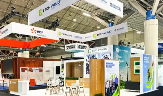
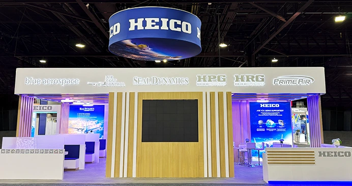
Red is a good color to use to get the word out when there is a deal going on right now that people need to know about. A lot of tech companies use red highlights to show that they are clever and willing to try new things. But too much red can make your eyes tired and even make you feel nervous, so it works better on accent walls or in certain advertising spots than on whole booth structures. Blue remains the most trusted color in the business-to-business world because it shows that you are reliable, quick, and tech-savvy.
People who make things, give medical care, or deal with money often use blue because it makes buyers see less danger. Different colors of blue tell us different things. People feel strong and trustworthy when they see dark navy blue, and they feel creative and friendly when they see lighter blues. Yellow is a good color for businesses that want to show how unique, clever, or good at solving problems they are. Startups that go to big trade shows often dress in yellow to look cool and on trend. Too much yellow could be bad, so neutral colors need to be used carefully to keep things in check.
Complementary Colors That Enhance Messaging
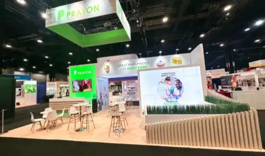
Green not only means "environment," but it also means "growth," "balance," and "forward momentum," all of which are good for businesses in the health sciences, food technology, or environmentally friendly fields. People who sell organic and sustainable foods will likely use green to show support for the industry and do better than their rivals at the next IFT FIRST Annual Meeting & Food Expo. Orange has the energy of red and the happiness of yellow mixed together.
It's a happy color that works well for consumer goods brands or companies that want to connect with younger people who make decisions. That makes it very useful when you need to stand out in a crowded show hall. Purple things are expensive, new ideas, and original ways of thinking. High-end brands and businesses that want to be the first in their fields will love it. Purple is often used in the beauty and tech industries to show that you are skilled without being too cold, like black or gray can be. People who are going to Cosmoprof North America Las Vegas should know this.
Color Harmony and Brand Identity Alignment
It's important for show color choices to strike a balance between brand consistency and psychology. Your main brand color should take up 60% of the space. A secondary color that goes well with it should take up 30%, and accent colors that stand out and make the design more interesting should take up 10%. We call this the "60-30-10 rule." It makes people aware of the business while making it have a bigger effect on their minds. You can find calm and friendly places on the color wheel by putting colors next to each other. This is great for places where trust is important, like medical or trade show booth environments. It's easy to stand out in a busy place when you use patterns with colors that go against each other. But be careful not to make the colors look bad together.

How to Leverage Color Psychology to Solve Common Booth Design Challenges
In display areas, color can be used in a smart way to move things along. If the people who buy things and sell them know about these problems, they can pick colors based on facts instead of what they want.
Standing Out in Crowded Exhibition Halls
When there are dozens or even hundreds of other booths, you want yours to stand out. That's what you should do. Most of the other sellers are using cool blues and grays, which will make your bright oranges and reds stand out right away. But the difference needs to be in line with what people in business expect. A bright pink booth might stand out at a show for consumer goods.
At a medical gadget show, though, it would make the trade show booth look less trustworthy. Different lights make colors look very different. The color temperature of LED lights can be changed at any time. If you're in a convention center with bright lights, this will make your booth look bright even if the color scheme wasn't planned well. At our Las Vegas site, we try color samples in a variety of lighting situations all the time to make sure that our clients' shows will still look good even if there are problems at the venue.
Building Trust With Decision-Makers
The colors someone uses make it easy to tell if they can be trusted. This is especially important if you want to reach operations managers and buying pros who don't like taking risks. Being safe and stable is a big deal when your booth is a big investment or a chance to work together for a long time. Deep blues and earth tones send that message together. The choice of material supports the color message.
If something has neutral-colored high-pressure laminates and a light roughness, it might look like it cost more and was made better. Then again, surfaces that are very bright and shiny might not seem as safe. Every job that HR Exhibits Service, Inc. does, they stress how your booth is made literally. The business looks consistent because of the colors used and the way the booth is put together.
Communicating Brand Values Through Visual Language
Colors should really show what a business stands for if it cares about the world. They can be shown through natural wood tones, organic greens, and earth browns instead of just adding green highlights to boring designs. Food and drink clients getting ready for the IFT FIRST show in Chicago often ask us for color schemes that hint at natural goods or farm-to-table realism. Brands need to try new things if they want to be unique. Things made of metal, especially copper and silver, make you think of new technology. You can get a modern look that shows you are ahead of the curve when you use white space and bright secondary colors together. This helps both new companies and big ones that are bringing out new items that will change the market.
Real-World Results From Color-Driven Redesigns
One of my clients made things, and their stands were all gray and looked like they would fit in at any industrial show. After the show, they had 43% more qualified booth guests and 28% more leads that turned into sales because they added navy blue main walls with orange accent zones that told the story of their new product. The new color not only brought in more people, but also the right people who knew what their new brand message was. The first booth of the medical sales director was light blue and white, which made it look useful but not unique.
The warm gray main structures in the show areas felt more finished and at ease when burgundy accents were added. This made people want to talk for longer. People stayed at their booths for 7.8 minutes on average instead of 4.2 minutes, which gave salespeople a lot more chances to talk to people who make choices.

Practical Tips for Applying Color Psychology in Your Trade Show Booth
Pay close attention to little things that make a big difference in how the booth turns out if you want to use color psychology to make one. With these helpful tips, you can be sure that the colors you pick will work the way you want them to in a real show.
Lighting Effects on Color Perception
In a meeting place, the lighting can be very different from one room or hall to the next. When fluorescent lights are on, colors get cooler. This makes blues and greens stand out more and dulls down warm colors. LED lights are now normal at big shows. Even though they show colors better, you should still try them out in real life. You should ask about the lighting rules when you are planning the event. In our factory in Las Vegas at HR Exhibits Service, Inc., we can make it look like there are different lighting conditions.
You can show off your goods at the McCormick Place in Chicago or the Las Vegas Convention Center, and the colors will look the same either way. Listen to these outside factors when your trade show booth looks very different in real life than it did in your computer models. They could give you cheap shocks. Built-in booth lights let you change how colors look. For LED tape lighting, you can change the settings in real time. This means that your exhibit will still look great even if the event lasts more than one day and the lighting changes for each stage.
Printing Techniques and Color Fidelity
A big picture costs a lot of money, so the colors need to be just right. Colors that are dye-sublimated printed on tension cloth have a lot of depth and stay stable, but they might not look as bright as colors that are printed directly on the fabric. The colors look bright and clear when UV light is used to print on hard things. This makes them great for big picture walls. A skilled color manager will make sure that the colors in your design files and the ones that are printed are the same, which is critical for your trade show booth to look professional and consistent.
Picture colors that are RGB don't work the same way when you print in CMYK. Being on a show with people who have done this before and know how to do it right won't hurt you. The people who work on production make sure the machines are in good shape and run test runs to make sure the colors are correct. This is especially important when matching booth colors to brand materials that are already out there.
Color Zoning for Functional Booth Layouts
Color can be used in a smart way to separate useful spaces and make it easier for people to move around. More often than not, softer colors make people want to move forward. This makes them great for places where people bring things to show off. Why are cooler colors great for meeting rooms or conference rooms where people will stay for a long time? Because they make people feel like they can escape. When the color strength changes, it can also change how big or small something looks. By painting some seats darker, you can turn them into meeting places for VIPs. It makes the rooms feel more personal and small. Colours that are lighter make things look bigger. No matter how small they are, this makes 10x10 or 10x20 TVs feel more open and friendly.
Eco-Friendly Color Options
The environment is becoming more and more important to people when they buy things. This is true for all types of companies. Bright colors are safe for the earth when you use low-VOC paints and finishes that are made with water. Fabric systems made from recycled polyester come in a lot of bright colors and show that you care about the environment. This is very important for companies that want to attend events that care about the earth. Because natural materials change color on their own, you don't have to use dyes to make things look interesting. People who care about the environment will like the real color and structure of bamboo, recycled wood, and natural fiber fabrics. They also meet the standards of a professional presentation.
Design Software for Color Visualization
Pro 3D modeling tools let users see color schemes before they decide to make something. It is possible to make things look more real with software like SketchUp, Blender, or tools made just for making displays. People who buy things, marketing teams, and design partners can all work together better with these tools. This way, everyone is on the same page before the production starts. VR walkthroughs go one step further than 2D models because they let people see color schemes and problems that they can't see in 2D models. With this technology, the approval process goes faster and costs less. This is very helpful when there isn't much time left before a show.

Comparing Color Strategies Across Different Trade Show Booth Types
Different kinds of show booths need different amounts of money, time, and care when they are built and shipped. You need to use color in different ways for each one. No matter what kind of booth you have, you can get the best results if you know how color choices affect the walls' strength.
Custom Booth Color Flexibility
You can use color in a lot of different ways with custom screens. When we build buildings from the ground up for corporations with lots of money, we can make color treatments, exact color matches, and one-of-a-kind materials. Normal systems aren't able to do these things. With special powder-coating and metallic laminate techniques, we were able to give a new client in the energy industry copper metallic details that matched their tools. This type of building lets you choose the color of the parts of the structure, rather than just seeing it on pictures.
To get color sets where every part supports the brand, painted metal extrusions, made-to-order laminates, and special finishes all work together. People who want their company to stand out at big events in their field should use this method. The money that was spent on special color creation is earned back many times over as the show goes. Once the colors and parts are picked out, every build after that will be the same. Brands that have booths at a lot of events every year need to make sure that their displays are always the same. Over time, this helps the brand grow.
Modular System Color Considerations
Companies that go to a lot of trade shows each year like flexible systems because they look good and can be used over and over again. You can pick a color from the basic styles that come with most apps. But many systems now have a lot of different colors because they have cloth screens and design pieces that can be switched out. You have to be smart about how you use pictures when the frames can bend. Large shots are mostly to blame for the color effect, since basic colors don't change.
With this method, the same frame system can be used for different businesses or show sets with different color schemes by just changing the pictures on the cloth, allowing your trade show booth to adapt quickly without buying a new structure. This type of method works well for brands that have more than one line of products or personality types. If a company makes a lot of different things, they might use the same frame but different color pictures for different kinds of goods, like medical tools, market goods, or machinery.
Portable Booth Color Strategies
Portable screens are made to be easy to move and set up. A lot of the time, they have pictures on cloth that are mounted on light metal frames. Since most frames are black or silver, color choices are based more on pictures than on the color of the building itself. If you print good cloth on mobile tables, the colors look great, and they're very easy to put together. When clothes are lighted, color effects shine like they would in a more expensive building that was built by hand.
People who run start-ups or are at trade shows and want to save money and have fun with color without spending a lot of money on a custom booth can use these methods. Since the layout doesn't change much, color is very important when making a trade show booth that can be moved. With the right color scheme, a movable booth can look like it costs a lot more than it does. When new businesses go to trade shows, they have to compete with bigger, more established businesses that can spend more money. This is important for them.
Rental Booth Color Enhancement
When you rent a booth, you have to deal with certain things because the buildings and color schemes are already set. It's important to find acceptable ways to add your brand's colors, like through decorations, pictures, and short-term changes. The color of a room can be changed right away by getting the right furniture. When you put together rental booths with simple gray frames and chairs in brand colors that are bright, they look very different.
Custom counter wraps, floor prints with your brand on them, and small touches like plants or book racks in your brand colors can make any hired building stand out. It's good for businesses to work with local partners like HR Exhibits Service, Inc. when they rent booths at big Las Vegas events to show off their goods. Because we're close to important places and know a lot about what's out there, we can help our clients find rental units that match their color schemes. After that, we can add special touches that make the names stand out without spending too much.
Conclusion
Not many people use it, but it's one of the best ways to sell a show. The colors you use in your trade show booth should reflect the values of your brand and help people remember it. They should also get people's attention and give you leads. Being able to explain how colors make people see and act gives you a big advantage over other people. This is true whether you're a corporate marketing manager plotting a big custom booth for IFT FIRST in Chicago or the founder of a new company trying to make the most of a small space at Cosmoprof North America.
Careful planning of color is an investment that pays off over many show runs by helping people remember the brand better each time. Tent builders can use color psychology, lighting, the right materials, and the way the structure is built to turn temporary trade show structures into powerful business development platforms that really bring in new business.
FAQ
How important is color consistency between my booth and other brand materials?
When you make things for your brand, like trade show booths and business cards, use the same colors. This will help your brand stand out. People might get lost if the colors don't match, which could hurt the brand's image that you've worked hard to build up. You don't have to always do the same thing to be steady. Big booths might need to have their color values changed so that they match the brand's general color scheme and are easy to see from far away. People who work as show partners know about these little things. It doesn't matter if the technical details are different from what you see in print; they can use your brand's rules in a way that makes sense at a booth.
Can poor color choices actually hurt lead generation?
Of course. People who visit a booth can drop by 30% or more if the colors don't match what the business or target crowd wants. People who are likely to buy will pass by your booth quickly if the colors are jumbled, don't stand out, or clash with other booths' colors in a way that makes them stand out. People who don't need your goods might come by if you pick the wrong colors. This wastes the time of your sales staff during busy show hours. Colors shouldn't be picked based on how they make you feel. You should instead make sure that the colors you choose help your business reach its goals and meet the wants of its audience.
What budget-friendly ways can I use color psychology effectively?
A color plan doesn't need to cost a lot to look good. You can be smart about color even in rental booths and movable structures if you choose the right pictures, furniture, and decorations. Don't try to cover every color zone; instead, focus on just one or two that stand out. You'll get more for your money this way. People will remember your business if you put your name on napkins, literature racks, and accent walls in key colors. These things don't cost much and make a big impression. When you work with show partners who have done this before and know about color psychology, you can get the most for your money.
Partner With Exhibition Specialists Who Understand Color Psychology
Because we know a lot about color psychology and have designed and built booths for many years, HR Exhibits Service, Inc. makes show places that really help businesses. Ready for the IFT FIRST Annual Meeting & Food Expo in Chicago or Cosmoprof North America Las Vegas in July 2026? Our building in Las Vegas and our experienced staff can help you get ready. This can be done with the help of local support, knowledge of the industry, and exceptional creativity that turns strategic color ideas into real show structures.
Companies in North America and around the world that work in tech, industry, medicine, energy, and market goods hire us to make booths. You tell us what colors you want and we set up the booth for you on-site. We make sure that everything fits with your brand and helps you reach your business goals. As part of our all-inclusive service, we set up the show for you, so all you have to do is get people to come in and talk to you. Get in touch with us at info@hrexhibits.com to learn how color psychology can help you get more out of your next trade show.
References
1. Labrecque, Lauren I., and Milne, George R. "Exciting Red and Competent Blue: The Importance of Color in Marketing." Journal of the Academy of Marketing Science, vol. 40, no. 5, 2012, pp. 711-727.
2. Singh, Satyendra. "Impact of Color on Marketing." Management Decision, vol. 44, no. 6, 2006, pp. 783-789.
3. Bottomley, Paul A., and Doyle, John R. "The Interactive Effects of Colors and Products on Perceptions of Brand Logo Appropriateness." Marketing Theory, vol. 6, no. 1, 2006, pp. 63-83.
4. Elliot, Andrew J., and Maier, Markus A. "Color Psychology: Effects of Perceiving Color on Psychological Functioning in Humans." Annual Review of Psychology, vol. 65, 2014, pp. 95-120.
5. Crowley, Ayn E. "The Two-Dimensional Impact of Color on Shopping." Marketing Letters, vol. 4, no. 1, 1993, pp. 59-69.
6. Gorn, Gerald J., et al. "Effects of Color as an Executional Cue in Advertising: They're in the Shade." Management Science, vol. 43, no. 10, 1997, pp. 1387-1400.
Embark on Your Journey to Exceptional Exhibitions! Contact HR Exhibits Today to Transform Your Vision into Global Success.
HR Exhibits Service, Inc.