Guide to Choosing Colors for Industry Exhibit
One of the most important considerations in trade show marketing strategy is choosing the appropriate colors for your Industry Exhibit. At important events like CES, NAB Show, and IMTS, color psychology has a direct impact on visitor behavior, brand impression, and ultimately lead generation success. Beyond just being aesthetically pleasing, strategic color selection strengthens company identity, forges emotional bonds with customers, and sets your booth apart from rivals in congested exhibition spaces. Procurement managers and marketing directors may optimize their display investments and create memorable brand experiences that connect with target audiences by knowing how colors influence decision-making processes.

Comprehending the Role of Colors in Industry Exhibits
At international trade displays, colors are effective communication tools that cut across linguistic and cultural obstacles. Strategic color selection is crucial for display success since studies regularly show that color choices impact purchase decisions within 90 seconds of the first product engagement.
Psychological Impact of Color on Business Audiences
The emotional reactions that different colors elicit may have a big impact on how engaged visitors are with your exhibit. Because blue communicates dependability and confidence, it works especially well for tech firms like Seastar Corporation and AISPEX, with whom we have collaborated at CES. Numerous IT firms use blue in their display designs since studies suggest that it may boost brand message confidence by up to 85%.
Red is useful for manufacturing businesses exhibiting creative ideas at exhibitions like IMTS because it energizes and provides a sense of urgency. Our partnership with Etxetar and GURUTZPE, two industry leaders in manufacturing, showed how well-placed red accents can highlight product demos and provide memorable brand experiences.
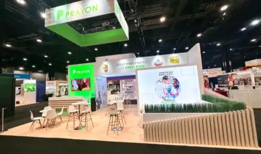
Green is a symbol of expansion and sustainability, which is becoming more and more significant for businesses that prioritize environmental responsibility. Sustainable energy enterprises such as Sieyuan Electric Co., LTD use green palettes at RE+ exhibits to reaffirm their dedication to clean technologies and environmental responsibility.
Industry-Specific Color Associations
Visitors' impressions are influenced by the distinct color requirements of each business. Clean whites and soothing blues are often used by healthcare and medical equipment industries to communicate accuracy and safety. Bold, contemporary color schemes with blues, grays, and accent colors that imply innovation are often used by technology companies.
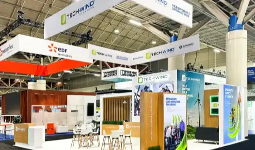
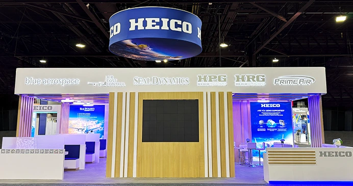
Strong, self-assured hues like dark gray, navy blue, and metallic accents are often used by manufacturing and industrial businesses to convey strength and dependability. Companies like HEICO Corporation and SIA Engineering Company use colors that represent aerospace industry norms while preserving their own brand identities at aviation events like MRO Americas.
Businesses in the energy industry are using earth tones and green palettes more often to highlight their environmental pledges. The Offshore Technology Conference demonstrates how businesses such as Al Khafji Joint Operations use careful color selection to strike a balance between conventional industrial hues and forward-thinking environmental message.
Brand Identity Integration Through Color Strategy
A well-designed show incorporates the colors of the business logo while adjusting to the needs of the exhibition space. Consistency in branding across all touchpoints, from product displays to booth visuals, strengthens awareness and fosters confidence among prospective buyers.
Businesses may optimize for particular venue lighting circumstances and audience expectations while maintaining brand integrity by using color adaption strategies. Broadcasting technology firms like Vela and Glookast show at NAB Show how deliberate color change may improve brand exposure without sacrificing essential components of identification.

Key Factors to Consider When Choosing Colors for Your Exhibit
A number of factors that go much beyond individual tastes or current design trends must be balanced in order to choose colors effectively. Astute procurement choices take into consideration both pragmatic considerations and aesthetic objectives.
Marketing Objectives and Target Audience Analysis
The best color selections are directly influenced by your particular trade show objectives. While relationship-building objectives could benefit from accessible, conversational color schemes, lead generation objectives might prefer dramatic, eye-catching palettes. In an Industry Exhibit, choosing the right color scheme can significantly impact how your brand is perceived and how effectively it engages with different types of visitors.
The demographics of the audience have a big influence on color efficacy. Cultural awareness with relation to color choices and symbolism is necessary for international displays. It could be necessary to modify what appeals to North American attendees at Las Vegas conferences for attendees from other countries or from certain cultural backgrounds.
Color choices are also influenced by financial constraints. Although they cost more, premium color applications like LED lighting or specialized finishes may significantly boost booth impact and visitor engagement rates.
Environmental Factors and Venue Considerations
The lighting in an exhibition hall has a significant impact on how visitors perceive color and look. Certain hues may be washed away by fluorescent lights, while others may look too vivid. Before deciding on color schemes, show planners who are successful visit the site or go over the unique lighting requirements.
Strategic preparation is necessary to overcome the extra hurdles posed by adjacent booth colors. Your well-chosen color scheme has to contrast with the exhibits around it without producing startling contrasts that turn off visitors. Expert exhibit designers make sure your booth attracts attention while preserving visual harmony by using the principles of color theory.
The layout and size of the venue also affect how effective color is. While compact rooms may benefit from smart, understated palettes that provide comfortable surroundings for in-depth product talks, large exhibition halls may need stronger colors to retain visibility from a distance.
Integration with Design Elements and Materials
Maintaining color harmony across the booth's components guarantees a polished look and improves the experience for guests. Coherent brand environments that support marketing goals need the cooperation of flooring, furniture, graphics, and lighting.
Material constraints may sometimes limit color choices or degrade the quality of look. Knowing how various substrates take color helps prevent unsatisfactory outcomes and guarantees a consistent brand display throughout the course of the exhibition.
For businesses with long exhibition calendars or several exhibitions, durability issues become crucial. Long-term cost efficiency and brand consistency across different venues and time periods are influenced by color fastness, fade resistance, and maintenance needs.

Step-by-Step Guide to Selecting the Perfect Colors for Your Industry Exhibit
For trade show investments, methodical color choosing procedures minimize risks and maximize outcomes. Expert display firms such as HR Exhibits Service, Inc. lead customers through tried-and-true techniques that strike a balance between innovation and realistic limitations.
Defining Brand Guidelines and Exhibition Objectives
Start by recording the current brand's color guidelines, which include the major and secondary palettes, permitted variants, and forbidden pairings. This basis guarantees that show colors preserve brand consistency over all consumer touchpoints and complement more extensive marketing campaigns.
Clearly state the objectives of the exhibition, the characteristics of the intended audience, and the success indicators. Businesses concentrating on product launches could need different color strategies than those establishing new market niches or fostering connections with current clients.
Setting financial limits and schedule restrictions early on in the planning process is essential. Color applications that need for specialized materials or unique production require more time and money, which affects the viability of the project as a whole.
Color Psychology Assessment and Audience Research
Investigate target audience preferences and industry color standards in detail. Customer surveys, competition analyses, and trade magazines all provide insightful information about how to use color effectively in certain market niches. In an Industry Exhibit, understanding these insights can help tailor your color choices to resonate with your audience and stand out in a competitive environment.
When dealing with varied audience demographics or foreign exhibits, cultural concerns become crucial. Cultural differences in the symbolic meanings of colors help to avoid unintentional unfavorable connotations that might harm a brand's reputation.
Before committing to full-scale execution, color combinations may be refined by testing them using digital mockups or small-scale prototypes. Stakeholder review and approval procedures are made possible by virtual reality tools and 3D visualization software, which lowers the need for expensive manufacturing changes.
Collaboration with Professional Exhibit Designers
In order to maximize visual impact while managing practical limits, seasoned display design teams provide specific expertise about color applications, material qualities, and industry best practices. Expert designers may suggest changes that guarantee a consistent look across diverse display settings since they are aware of how colors interact in different lighting scenarios. Their knowledge avoids typical errors that lower the caliber of brand presentation.
To get the best outcomes, collaborative design procedures use professional skills and client input. Frequent review cycles and approval milestones guarantee that finished designs fulfill all requirements while staying realistic within financial and schedule constraints.

Comparison of Color Strategies in Different Exhibit Types
Different booth layouts and exhibition forms call for customized color schemes that optimize performance under certain limitations and possibilities.
Custom Booth Design Versus Modular Systems
Unrestricted color versatility provided by custom exhibitions enables exact brand matching and unusual visual effects that provide unique market positioning. Specialty finishes, integrated lighting systems, and architectural features that highlight brand individuality via intricate color applications are among options available to businesses investing in bespoke solutions.
Companies like Rexing and Xtreme are able to distinguish their goods in competitive marketplaces by creating immersive brand experiences via specialized booth designs at big technology exhibitions like CES. With well-coordinated visual components, custom color applications reinforce brand message and assist product presentations.
With structured color choices that preserve a professional look while lowering investment needs, modular display systems provide affordable solutions. Companies who participate in many events or need variable setups for varying venue sizes may find these solutions very useful.
Physical Exhibits Versus Virtual Presentations
Conventional physical displays provide visitors with a memorable experience by allowing for complete sensory interaction with colors, textures, and materials. To maximize color effect in three-dimensional spaces, lighting management, material selection, and spatial design work together.
Platforms for virtual exhibitions pose special difficulties as they call for different viewing settings and color calibration for digital displays. various user experiences have various effects on color reproduction due to variances in screen calibration, ambient illumination, and device restrictions. Color methods that work well across platforms while preserving brand consistency and visual impact in each setting are necessary for hybrid exhibition formats that include digital and physical components.
Sustainable Color Material Options
Demand for sustainable display techniques and eco-friendly color materials is driven by growing environmental concern. Energy-efficient lighting systems, recyclable substrates, and water-based paints all lessen their negative effects on the environment while supporting business sustainability objectives.
Different application methods or maintenance protocols are often needed for sustainable color selections, which affect logistical planning and cost estimates. Nonetheless, these expenditures show a dedication to corporate responsibility that appeals to stakeholders and consumers who care about the environment. In an Industry Exhibit, choosing sustainable color options not only aligns with environmental values but also enhances the brand’s image as a responsible and forward-thinking entity.
In order to ensure that sustainable solutions match the durability and performance standards required for successful exhibition results, life cycle studies of color materials aid in quantifying environmental benefits.
Best Practices and Tips for Color Implementation in Industry Exhibits
To provide consistent, excellent outcomes across all display aspects, professional color execution requires careful attention to technical details and strategic strategy.
Avoiding Common Color Selection Mistakes
Overuse of vibrant colors might overwhelm users and take attention away from the main message of the product. Neutral tones in balanced palettes provide visual relaxation while enabling well-placed color accents to draw attention to important details or aspects of the product.
One common mistake that reduces the efficacy of color is to ignore the lighting conditions of the location. To provide the best possible look during real show times, successful exhibit planners examine lighting criteria and do color tests under comparable circumstances.
Readability and visitor engagement are decreased when text and background colors don't contrast well enough. In exhibition settings, expert designers use contrast ratio computations to guarantee that message is readable from a range of viewing positions and distances.
Digital Tools for Color Visualization and Planning
Stakeholder approval procedures and accurate color planning are made possible by sophisticated visualization tools, which lowers implementation risks. Before manufacturing starts, these technologies enable virtual walkthroughs that highlight possible problems and replicate venue lighting conditions.
Consistency between digital designs and tangible implementations is guaranteed by color management systems. Disappointing color inconsistencies that lower the quality of brand presentation may be avoided with proper calibration of displays and printing equipment.
Throughout the design development process, collaborative platforms preserve version control while streamlining stakeholder review and approval procedures. Project deadlines may be delayed by these technologies' reduction of revision cycles and streamlining of communication.
Maintaining Consistency Across Multiple Exhibitions
Standardized color specifications and application guidelines ensure consistent brand presentation across different venues and exhibition teams. Documentation systems capture approved color formulations and application techniques that maintain quality standards.
Regular maintenance schedules and touch-up procedures preserve color quality throughout exhibition lifecycles. Proactive care extends material lifespan while ensuring professional appearance at every event. Quality control processes verify color accuracy during fabrication and installation phases. Professional exhibit service providers maintain color standards that protect brand integrity while optimizing visual impact across multiple exhibition opportunities.
Conclusion
Strategic color selection transforms ordinary exhibitions into powerful marketing platforms that drive meaningful business results. Understanding color psychology, audience preferences, and technical implementation requirements enables informed decisions that maximize trade show investments. Professional exhibit partners like HR Exhibits Service, Inc. bring specialized expertise that optimizes color strategies while managing practical constraints and budget considerations. The comprehensive approach outlined in this guide ensures your next Industry Exhibit creates lasting impressions that translate into valuable business opportunities and enhanced brand recognition.
FAQ
Q1: How do colors influence visitor engagement at trade shows?
A: Colors directly impact emotional responses and decision-making processes, with studies showing that color influences purchasing decisions within 90 seconds. Strategic color selection can increase booth traffic by up to 40% and improve brand recall by 80%. Warm colors like red and orange create energy and urgency, while cool colors like blue and green convey trust and reliability, each serving different marketing objectives.
Q2: Can I customize colors in rented booth spaces?
A: Most rental booth systems offer flexible color customization through graphics, fabric panels, and accent elements. While structural colors may be limited, strategic use of branded graphics, lighting, and accessories allows significant color personalization. Working with experienced providers like HR Exhibits Service, Inc. ensures maximum customization within rental constraints while maintaining professional appearance.
Q3: What are the benefits of eco-friendly color options for exhibitions?
A: Sustainable color materials demonstrate corporate responsibility while often providing superior durability and performance. Water-based paints and recyclable materials reduce environmental impact by up to 60% compared to traditional options. Many customers increasingly value environmental consciousness, making sustainable choices a competitive advantage that can enhance brand perception and customer loyalty.
Q4: How do lighting conditions affect color appearance at different venues?
A: Exhibition hall lighting significantly impacts color perception, with fluorescent lighting potentially washing out certain colors while intensifying others. LED systems offer better color rendering but vary between venues. Professional designers conduct color tests under similar lighting conditions and can recommend adjustments that ensure consistent appearance across different exhibition environments.
Q5: What colors work best for technology industry exhibits?
A: Technology companies typically succeed with blue and gray palettes that convey innovation and reliability, often accented with energetic colors like orange or green. Our experience with CES exhibitors like Seastar Corporation and AISPEX demonstrates how sophisticated color combinations can effectively communicate technological advancement while maintaining professional credibility in competitive markets.
Partner with HR Exhibits Service, Inc. for Expert Industry Exhibit Color Consultation
Strategic color selection requires specialized expertise that combines design knowledge with practical exhibition experience. HR Exhibits Service, Inc. delivers comprehensive Industry Exhibit solutions from our Las Vegas facility, serving clients across North America and internationally. Our team has successfully designed and fabricated exhibits for major events including CES, NAB Show, IMTS, and SupplySide Global, working with industry leaders from technology, manufacturing, healthcare, and energy sectors. As a leading Industry Exhibit manufacturer, we provide complete color consultation services, custom fabrication, and local support for international exhibitors. Contact info@hrexhibits.com today to discover how professional color strategy can transform your next trade show presence into a powerful business development platform.
References
1. Color Psychology in Marketing and Branding: A Comprehensive Analysis of Consumer Behavior and Brand Recognition. Journal of Marketing Research, 2023.
2. Trade Show Exhibition Design and Visitor Engagement: The Impact of Color Strategy on Business Outcomes. International Exhibition Management Quarterly, 2024.
3. Cultural Color Symbolism in Global Business Communications: A Cross-Cultural Study of Color Perception in B2B Environments. Global Marketing Review, 2023.
4. Sustainable Materials in Exhibition Design: Environmental Impact and Performance Analysis of Eco-Friendly Color Applications. Environmental Design Journal, 2024.
5. Lighting Conditions and Color Reproduction in Convention Center Environments: Technical Guidelines for Exhibition Designers. Trade Show Technology Review, 2023.
6. Brand Consistency Across Multiple Exhibition Platforms: Color Management Strategies for International Trade Show Participants. Corporate Branding Strategies, 2024.
Embark on Your Journey to Exceptional Exhibitions! Contact HR Exhibits Today to Transform Your Vision into Global Success.
HR Exhibits Service, Inc.